Friday, January 11, 2013

Face of an Angel


This is another layout that went together so quickly. Again, I don't know this girl's name she's from my "Borrowed Family" set of pictures.
 

A closeup of the top right corner. I used a punch around the entire page.

A closeup of the jewel flowers, these were from Joann's that I picked up quite some time ago.

A closeup of the flowers and the bee. The bee is actually a 3D piece that you would use in an artificial flower arrangement maybe.
Thanks for looking and have a wonderful day!
Posted by Picasa

Saturday, December 8, 2012

"Baby Lexi", A mini album for my friend Linda


This is an Echo Park mini album that has pull out pages. I inked the edges of the cutout and now wish I wouldn't have. When I started out I had a completely different idea and as I progressed it took on a whole different process. Other than the inked edges I think it turned out pretty good. I hope she likes it. This lucky grandma gets this on Tuesday.
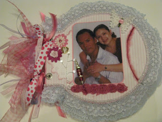
I added a number of different ribbons to the rings mostly in pinks and whites but there's a couple of blues on there, too even though you can't see them very well in this picture.

This is a picture of my friend Linda's daughter Alicia, her husband Jason and their new little one Lexi.
Isn't she absolutely adorable??!!! This has a light blue lace trim to tie in Jason's blue striped shirt, some various layered paper flowers, I hand cut a circle then punched around it with a Martha Stewart corner punch to make a doily then inked the edges a bit and cut it in half and tucked it under the picture. I added a heart button, a jeweled bling piece, some mini rose trim, a butterfly and a stick pin I made.

I used various papers from my stash and rounded the edges of the pics and the mats with my 1/2" corner chomper, blue lace around the edge, some flowers and some jeweled bling a button and the butterfly at the top is one of my own I made. I made a bow and added a pink mini paper rose at the center and attached it to the pullout.

Same page but open, this is such a great album for a handful of pics of one event.

I used some pearl strands, charms, chipboard word, buttons, and pink layered flowers (but they really look peach here). I added Stickles to the top flower to give it a bit of a pop. The butterfly is one I made. A pink and white lace trim for the outer edge.

Here again with the page open. She's so snuggly looking I could curl up with her and take a nap.

Another butterfly I made, heart pearl buttons, a metal word on the pullout, some tiny paper roses, some premade flowers with brads inserted for centers and a different ruffly lace trim around the outer edge. Again added a bit of blue to this to help tie in Jason's shirt. I tried brown on some of the pages and I just couldn't get it to look right without overpowering the rest of the page so I stuck with the pinks and a touch of blue here and there. Still pretty girly girl.

Same page open.
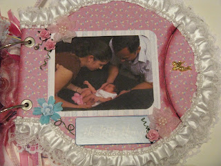
This page has got satin trim and pearls around the outer edge, chipboard word, mini paper roses, a charm, and other flowers.
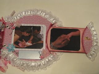
Same page open.

This page has white satin trim around the edge, some mini rose trim, tiny white satin flowers, a butterfly I made, a few mini paper roses, and her name in pink glittered foam letters.

Same page open.

This is the back page. The album only comes with 3 pages and I wanted to make one more for all the pics I had so I cut two from medium weight chipboard and layered them together so they would match the thickness of the other pages. I trimmed the edge in a pink satin and lace trim, added a strand of pearls over the edge. I punched a doily out of plain white cardstock and inked the edges and cut it in half and put under the picture. I used a chipboard word, layered paper flowers, and a button.
The back I just left a plain pink dotted swiss and edged it in white lace.
All in all I think it turned out okay (other than the inking) and next time I will know better.
Thanks for looking and please let me know what you think.
Have a great day!
Posted by Picasa

Saturday, December 1, 2012

Wedded Bliss


Here's a layout that could be used for either wedding or anniversary pictures.
This picture is from my "Borrowed Family" collection again. I really, really like the black and white photos.

A closeup of the word stone, flowers, doily and branch bling plus some of the ink distressed edges.

A closeup of the bow and bling at the bottom of the layout.

A closeup of the distressed edges and the gate I distressed from Dusty Attic. Thanks again to Vickie Alberto for having such a wonderful selection of Dusty Attic. Check out Vickie Alberto's shop on Etsy or even her blog at simplypaperandcreativity@blogspot.com
She is very, very talented!
Posted by Picasa

Wednesday, November 28, 2012

My Gift


This is a layout I did for a friend of mine's daughter. I love how it turned out.
The child is again "Borrowed Family" and I made it so she can take this picture off and put her own on it. This just gives her an idea of how it would look.

Close up of the flowers, lacing and stickpin I made.

Thanks for looking!! Leave me a comment. ;)
 
Posted by Picasa

Sunday, November 4, 2012

Timeless


I did this piece for a girlfriend that was moving away. I did not put any title on it nor any journaling, I left that all up to her. She told me the colors that she wanted and the size of picture she intended to place on it. I used one of my "Borrowed Relative" pictures just so she could see what it would look like. This is a bit bigger than 5 x 7 pic and she wanted it to fit an 8 x 10 but I think even this wide mat looks good with this pic.
She loved it so much she had me do one for her daughter. I will be posting that soon.
Leave me some love!! TFL!
Posted by Picasa

Tuesday, October 30, 2012

Precious


This is another layout I made. I have no idea who this baby is, she is one of my "Borrowed Family" members. Isn't she simply precious???

Some closeups:

This is a Dusty Attic piece I got from Vicky Alberto's etsy store here :  http://www.etsy.com/shop/vickyalberto
Vicky is the absolute BEST to order from, she tries to get the items you want plus she ships SUPER FAST!!!  I highly recommend her (plus her blog is pretty sweet, too!)
I just touched it up a bit here and there with some cream colored acrylic paint.

Some burgundy paper flowers and silk leaves and a berry stem.

The same in the opposite corner plus lace placed under the torn and distressed paper edges.

The paper is from my stash (unk. co.) and I stamped some words in a few places.
Hope you like it, thanks for stopping by and please leave me a comment.
Posted by Picasa

Monday, October 29, 2012

Faux Mini Wedding Cake #1


Here's something a bit different. I decided to try and make a set of stacked boxes to look like a cross between a wedding cake and decorated hat boxes.

A side view...

View of the top tier, sorry the focus seems to be off on this one.

And a closeup. The papers are some from my stash I have had for quite some time. I did a thin white wash over them all to make them seem more unified. I added lace, pearls, and flowers to finish it all off.
TFL!!! Have a great day!
Posted by Picasa